The spellbinding series 'The Queen's Gambit' which followed Beth Harmon’s fascinating story and its gripping chess battles, represented by a number of outstanding sets based upon iconic wallpapers, took the world by storm. Having had the honour to provide some of those very wallpapers, we couldn't resist the opportunity to sit down and have a chat with Sabine Schaaf, the visionary set designer of the series. This exclusive interview will enable you to understand the creative process that brought the series' unforgettable visual aesthetic to life.
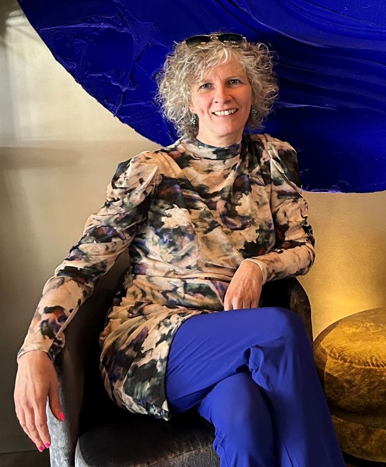
Can you provide some insights into your role as the set designer in the production of ‘The Queen's Gambit’?
My official job title is “set decorator” and my main task is to take care of everything to do with furnishing the sets. That literally means everything, from wallpaper to furniture, including lamps, carpets, curtains as well as decorative objects such as pictures, plants and shelves. You need to know that most of the rooms in which we did the shooting were initially empty. Everything that you see on screen had to be brought to the location, installed and furnished by us. Once the shooting is done, we have to dismantle everything, pack it up and bring it back to the prop rental where we source the vast majority of the furnishings we use. Think of it like a very big house move, over and over. Our production designer Uli Hanisch prefers to shoot in actual locations rather than in a studio. In ‘The Queen’s Gambit’, for example, the orphanage you see in the first episode in reality is an empty old villa in the Berlin suburbs. The cellar where Beth is taught to play chess by Mr. Shaibel is part of a government office in the Berlin district of Neukölln.
What are the key considerations that went into designing its sets? How do you balance historical accuracy with creative license when designing the sets?
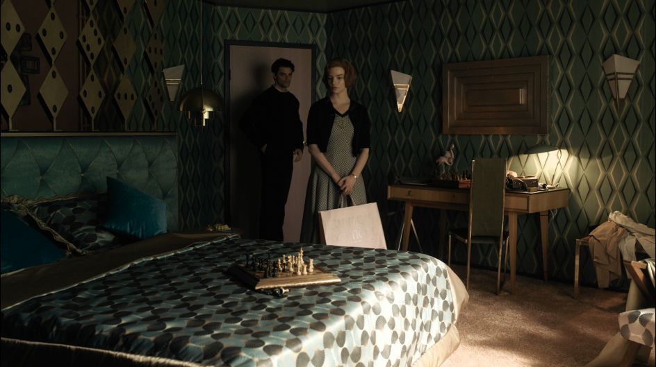
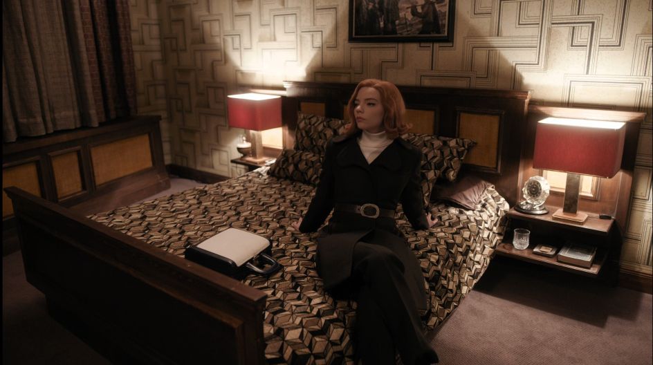
The starting point is always the script, as the story it tells creates specific spatial images in my head which I then develop with my production designer, outlining the challenges and requirements of the project. For ‘The Queens Gambit’, a key factor was the visual differentiation of recurring motifs (plane - hotel room - chess tournament) in the various countries Beth visits as she progresses in her career. In terms of colours, shapes and furnishings, we wanted to differentiate them as much as possible. At the same time, we made sure there were also unifying elements, such as the paintings in all the hotel rooms which exclusively depicted women, as if they were supporting Beth in the otherwise male-dominated world of chess.
When it comes to being historically correct, I love to quote the saying “you have to know the rules to break them”. I often make use of minor historical inaccuracies because they round off the set design or sometimes disrupt it. It's all fair game. I think our secret (which is no longer a secret) is to work against general viewing habits. We use the word "tasteful" rather contemptuously, we expressly don't want to be that. We want to gently irritate the viewers and take them by the hand when they stumble across our tasteful irritations. It's a hell of a lot of fun to be able to let off steam without the boundaries of “tasteful”!
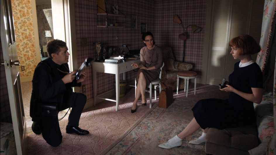
Wallpapers play such a dominant role in setting the stages of Beth’s life and career. Was it clear from the beginning that you will make such extensive use of them or did the decision evolve over time?
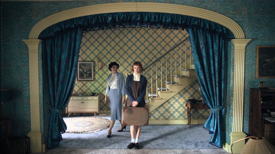
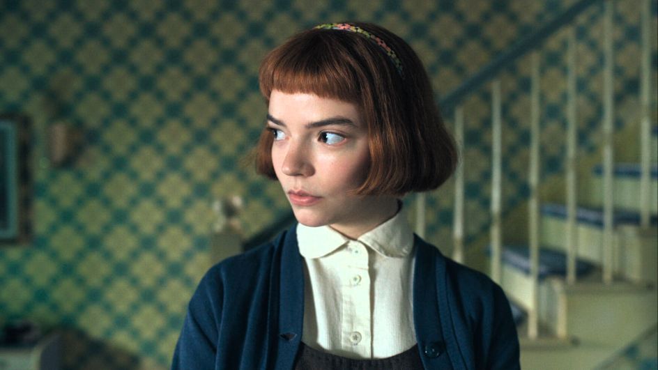
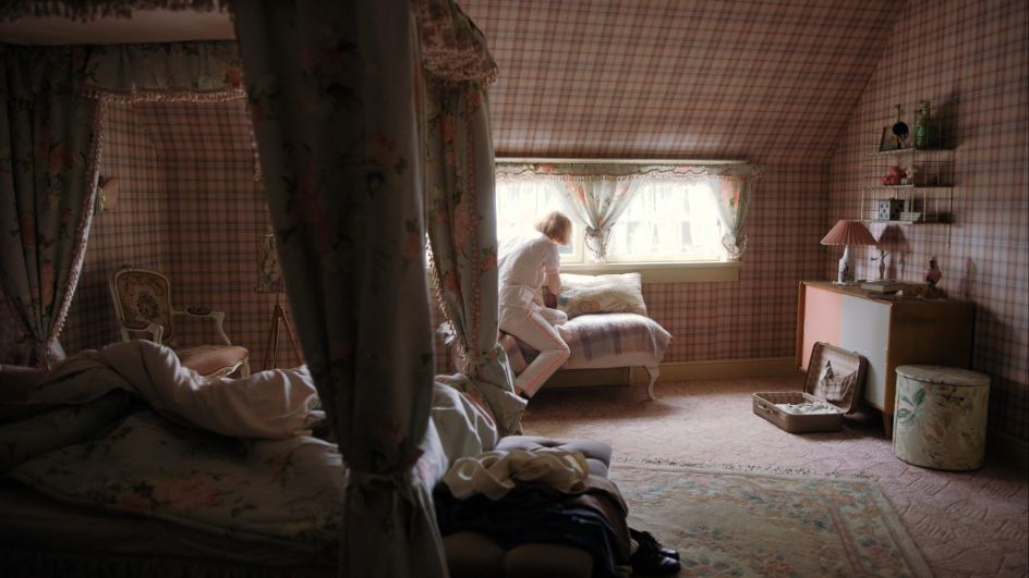
No, that wasn't clear at all. We initially approached the shooting as we always do. However, we soon realised that for the hotel rooms and for many other sets, wallpapers would have been a great solution, so they became progressively more and more prominent. When sourcing the wallpaper for Beth's parents' house in Lexington, we went a bit crazy. There we a number of actual historical wallpapers we bought from a store in Cologne that unfortunately no longer exists. The wallpaper in Beth's bedroom is contemporary, while we thought the chequered pattern was perfect as an homage to the chessboard. We deliberately used floral wallpapers in the house as we wanted to portray the playful, romantic character of Beth’s adoptive mother, providing a contrast to her far-from-harmonious family life. It was a lot of fun to keep looking for and finding completely different models and that's how the excessive wallpaper madness came about!
What factors influence your choice of wallpapers for different locations within the series, such as era authenticity, character personality, or thematic elements?
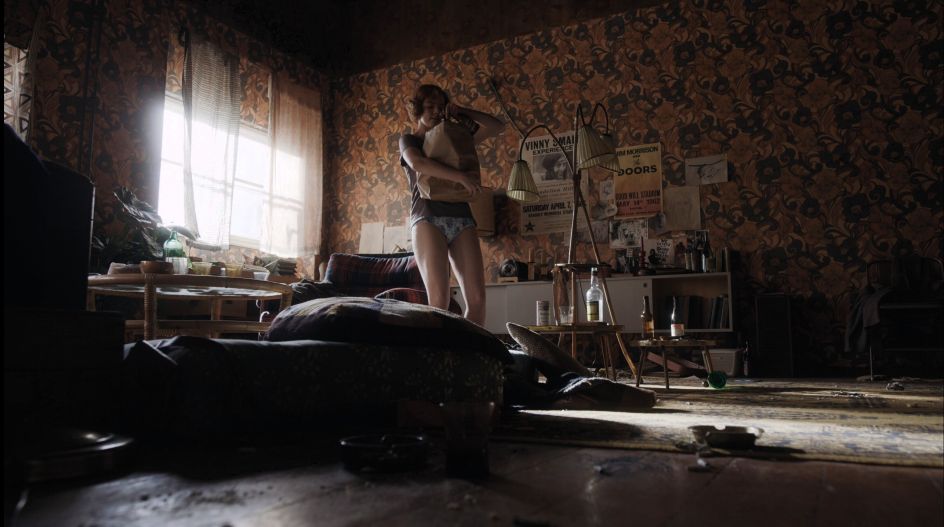
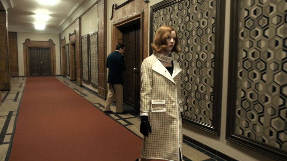
The rule is that each wallpaper should fit in with the period we plan to depict. Obviously, it can always be older, as it may have been hanging on the wall for a long time, however we allow for some exceptions. For example, in Eileen and Barbara's flat share, where Beth tidies up the morning after the party, we purposely chose a wallpaper that was very reminiscent of 70s design. It wasn’t an historical match, but we thought it was so appropriate for the scene, so we took the liberty of using it. Our colour concept and the choice of wallpapers and furniture gave each location in the film its own look. Mexico, for example, was colourful and floral, Moscow very strict, geometric and with no bright colours, etc.
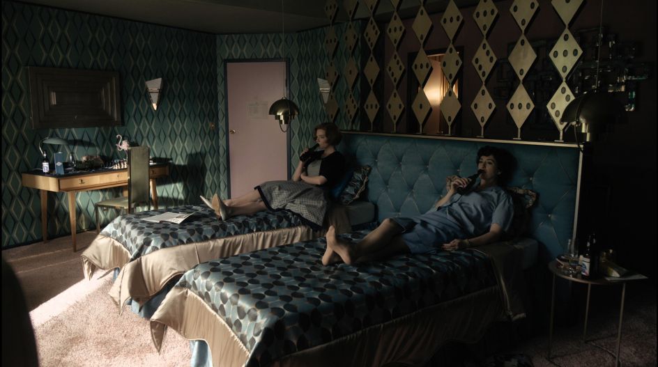
Were there any specific materials or textures of wallpaper that you found particularly effective in conveying the desired aesthetic?
Interesting graphic, high-contrast patterns are our favourites. We love materials that our scene painters can then treat further, for instance covering them with a solution of water and glue so that the surface then cracks and tears.
Could you walk us through the logistics of incorporating wallpapers into the sets? How did you ensure they complemented the overall design scheme?
The way we approach each set can be very different: sometimes there is a theme, a catchphrase or a motto, sometimes a piece of furniture or a light fixture piques my interest, and we decide to use it as a guideline for the set. Sometimes it’s a wallpaper that serves as our first design idea, like for the Las Vegas sets in ‘The Queens Gambit’ where the diamond pattern above the bed in the hotel room turned out to be the key element for the art department to develop the set.
Could you elaborate on the process of physically implementing wallpapers on set, including any techniques or considerations involved?
Wallpapers have to be installed on site quite early, as they have to be put up by the painters first but also painted over several times, often with different coloured glazes. The multiple glazes give them patina and a spatial depth that makes them appear old. This is extremely important for historical series and films. If we depict a poor neighbourhood, the wallpaper is sometimes first put up and then partially torn off or “repaired”. Sometimes we need to change some of the wallpaper colours through different glazes because otherwise the wall is too light, and it can happen that a pink peacock-pattern suddenly turns into a dark green one. We prefer to work with darker surfaces to that the focus remains on the actors, plus it allows the camera to create greater contrasts and more dramatic lighting.
What feedback or reactions have you received regarding the set design and use of wallpapers in ‘The Queen's Gambit’?
It was simply incredible, we’ve never had such a reaction before! We won the Art Directors Guild Award, the SDSA Award (Set Decorator Association of America) and an Emmy for our work in ‘The Queen’s Gambit’. It was of course a unique experience and it’s great to receive recognition of our work. The funny thing is that, as my boss Uli Hanisch once told me, we approached this project as we always do, with attention to detail and a desire for unusual, crazy combinations.
Have you noticed any trends or shifts in audience expectations regarding set design and interior aesthetics in recent years?
I do believe that the public's expectations have grown. These days, nobody wants to see minimal sets that you can tell were built in the studio. If the set design, costumes and make-up complement each other and interweave with the story, then you can take the audience on a great journey.
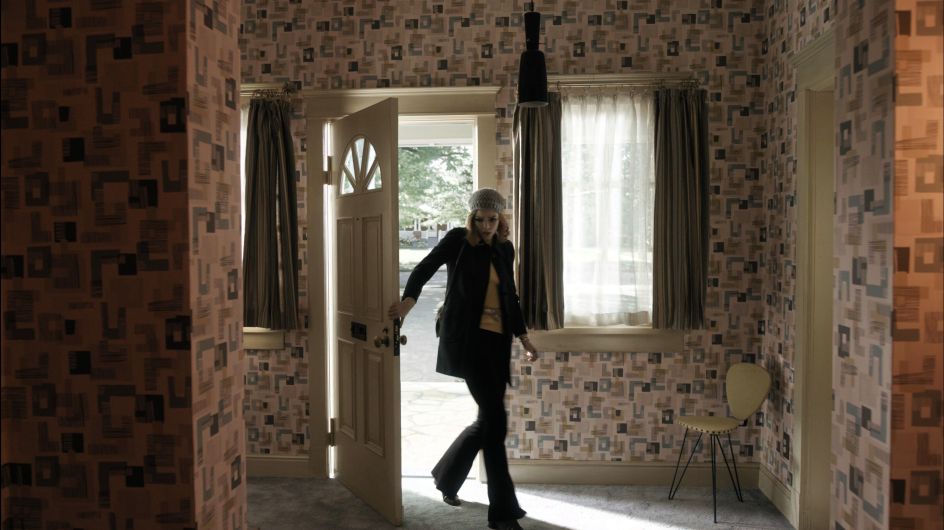
From your perspective, what makes wallpaper such a powerful tool in visual storytelling for television?
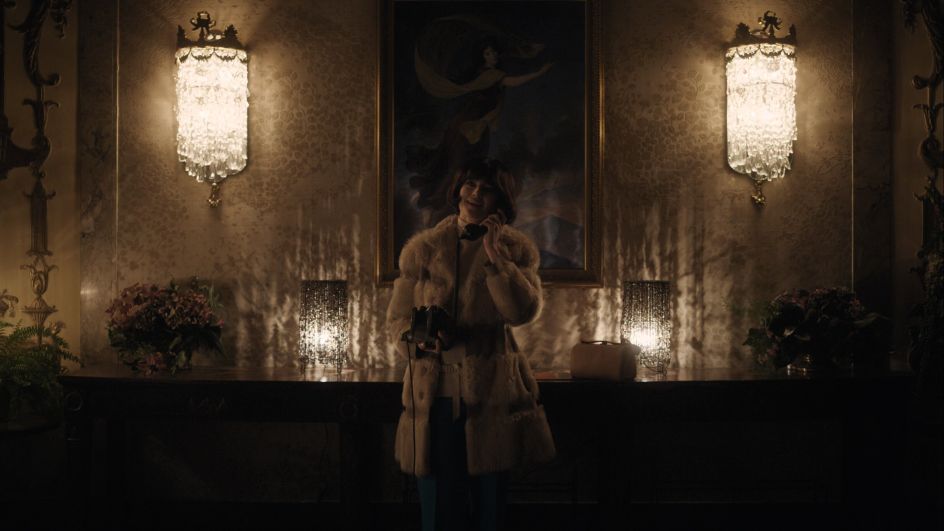
A single wallpaper can reveal a lot of information: it might have been on the wall for many years before our story takes place, it can tell the audience whether those who live there are rich or poor, if the space is inhabited or abandoned. It can hang mouldy and in tatters from the wall, or it can be set in an affluent ambience with splendid wall lighting. Talking of which, wall lighting is the best way to set the scene for wallpaper as it creates islands of light that, in combination with the unlit areas, form an exciting background for the film's protagonists.
Are there any upcoming projects where you're excited to explore new possibilities with wallpapers in set design?
For sure. We will most likely start the 5th season of Babylon Berlin in late summer and wallpapers will continue to play a significant role there.
If you want to know more about the key role played by wallpapers in ‘The Queen’s Gambit’ and how to recreate its iconic looks in your own home, check out our in-depth article: A visual journey across "The Queen's Gambit" wallpapers.

